Impressionist Color Harmony: Complete Mixing Guide
Achieving Impressionist Color Harmony: Your Comprehensive Guide to Mixing Paint
Achieving Impressionist color harmony akin to that of the master artists of the era might seem a Herculean task, but with the correct techniques and understanding, you can mix sumptuous colors that exude perfect balance and serenity.
Allow me to take you on an informative journey through the methodology of impressionist color mixing. This guide will unveil the tricks and techniques employed by revered artists, such as Monet and Renoir, to envision their enchanting masterpieces.
Decoding the Impressionist Approach to Color Theory
The Impressionists rewrote the rules of color theory when they transitioned from using muddy, darker palettes to brighter, more vivacious hues. Their groundbreaking realization was that colors often seemed different depending on the surrounding colors. For instance, shadows are not always black or brown, they embody reflected colors from nearby objects.
Impressionists noticed the warmth radiated by highlights that are bathed in sunlight, whereas shadows possessed cooler tones. This observation of the warm-cool duality laid the foundation for their distillation of color harmony.
Further, the Impressionists learned that by positioning complementary colors adjacent to each other, both colors appeared more lively. Observing such versatility in colors allowed them to let the viewer's eye do the color mixing, instead of their paintbrush.
Essential Paints for Recreating Impressionist Harmony
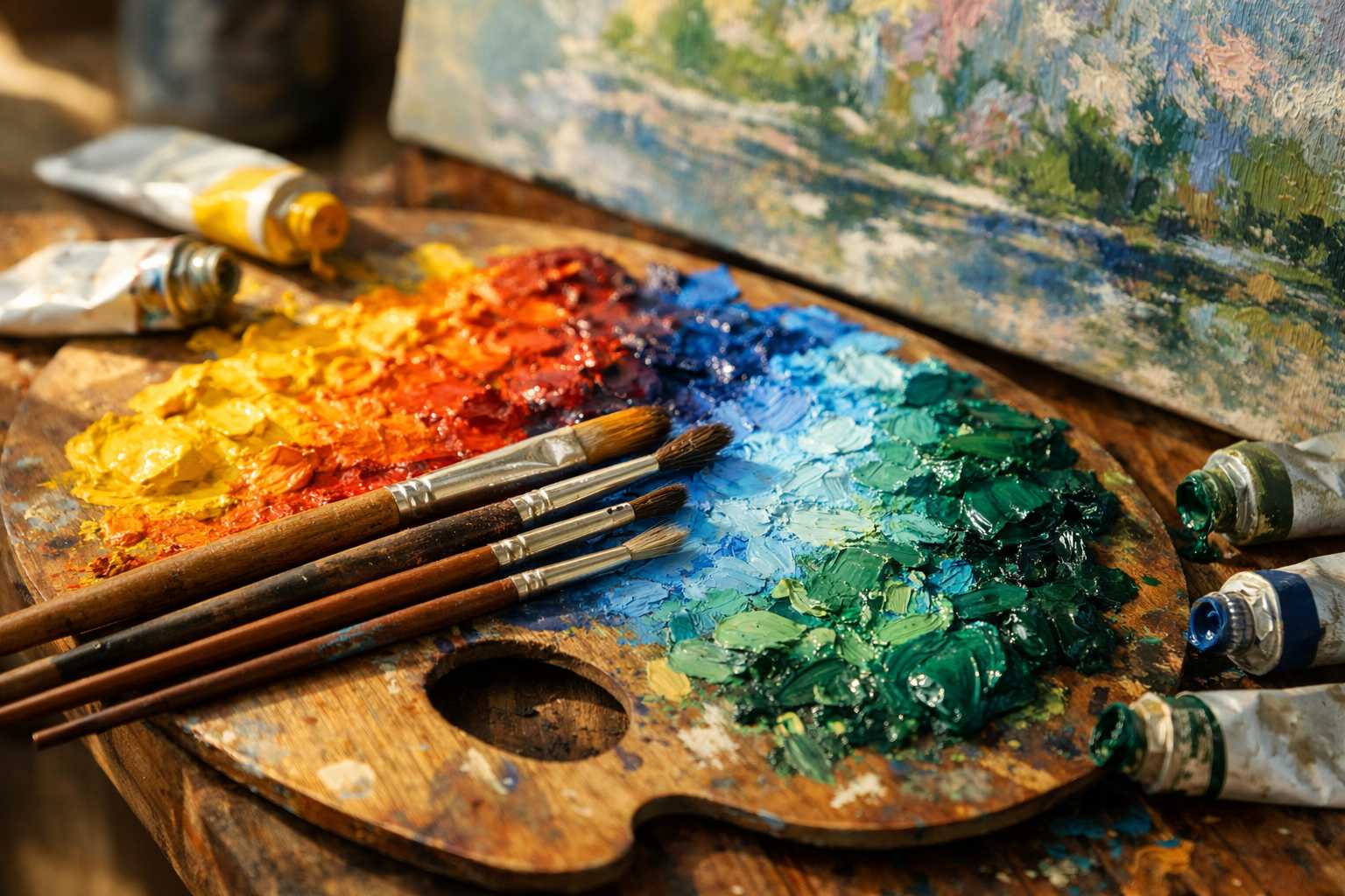
You only need to start with a handful of colors to create impressionist harmony:
Warm Colors: - Cadmium Yellow Light - Cadmium Orange - Cadmium Red Light - Burnt Sienna
Cool Colors: - Ultramarine Blue - Cerulean Blue - Viridian Green - Alizarin Crimson
Neutrals: - Titanium White - Raw Umber
This palette of colors gives you the essential elements for establishing beautiful color relationships. There is a cool color to balance each warm color, forming a harmonious palette.
Understanding the Warm-Cool Color Relationship
Mastering the warm-cool relationship can transform an ordinary painting into a masterpiece. Each color temperature has its opposite, providing a dynamic visual impact.
Consider sunlight striking a white building. The illuminated areas appear warm yellowish-white, while the shadowy areas are tinged with a cool blue-purple.
Here's how you can accomplish this effect :
- Make highlights warmer than your base color
- Make shadows cooler than your base color
- Use warm colors to bring objects forward
- Use cool colors to push objects back
Initiate this practice with straightforward subjects. For example, you can paint an apple with warm reds in the light and cool purples in the shadow.
Techniques for Adjusting Color Temperatures
The process of temperature mixing requires subtlety. A small dab of color can result in significant temperature changes.
To Warm Up Colors: - Add small quantities of cadmium yellow - Incorporate a touch of cadmium orange - Add hints of burnt sienna for earthy warmth
To Cool Down Colors: - Add small amounts of ultramarine blue - Blend in traces of viridian green - Include hints of alizarin crimson for a touch of cool purple
Remember: less is more. Start mixing in minute quantities and gradually build up from there.
How to Create Atmospheric Perspective
Impressionists were renowned for their ability to denote distance using color. Items that are far away tend to look cooler, lighter, and less detailed.
For Distant Objects: - Use cooler color temperatures - Mix more blue or purple into your colors - Reduce color intensity - Make the values lighter
For Close Objects: - Use warmer color temperatures - Add more yellows and oranges - Increase color intensity - Accentuate value contrasts
Utilizing this technique can bring an incredible sense of depth to your artwork. It will create the illusion that the viewer could simply walk into the painted scene.
Incorporating the Techniques of Broken Color and Optical Mixing
Impressionists frequently opted for pure colors placed side by side in lieu of thoroughly mixing colors on the palette. This method allows the viewer's eye to blend the colors when seen from a distance, leading to a more vibrant result than palette mixing alone.
Give These Techniques a Try: - Apply small strokes of unadulterated color next to each other. - Allow some areas of the canvas to peek through the strokes. - Make your brushwork direction variable to add excitement. - Gradually layer multiple colors onto areas.
The outcome? Colors that sparkle with liveliness and light.
Handy Exercises for Practicing Color Harmony
Exercise 1: Simple Color Temperature Studies Paint the same object under warm lighting and then under cool lighting. Notice the differences in shadow colors under varying lighting conditions.
Exercise 2: Practicing with Complementary Colors Select two complementary colors. Paint them adjacent to each other using small strokes. Take a few steps back and observe how the colors enhance each other's hue.
Exercise 3: Studying Atmospheric Depth Paint a simple landscape, ensuring the foreground is warm and intense. Gradually transition the colors from warm to cool and lighten them the further they recede into the backdrop.
Exercise 4: Implementing the Broken Color Technique Instead of mixing green on your palette, apply small strokes of blue and yellow next to each other. Observe the difference in vibrancy compared to a pre-mixed green.
Common Mistakes in Achieving Color Harmony
Mistake 1: Over-mixing Colors Excessive blending can result in murky colors. Allowing variation in your mixes can infuse vivacity into your color palette.
Mistake 2: Disregarding Color Temperature Every color has a temperature, whether warm or cool. An artwork comprising solely warm or cool colors will seem dull and uninteresting.
Mistake 3: Overuse of Intense Colors Avoid having every color in your palette demanding attention. Using intensified colors sparingly can maximize their impact.
Mistake 4: Neglecting Reflected Light Shadows aren't merely darker versions of the local color. They echo light reflected from surrounding objects.
Advanced Impressionist Techniques
After mastering the basics, experiment with these sophisticated methods:
Color Gradation: Gradually shift color temperatures across a form. Begin with warm colors in the light and transition to cooler tones in the shadow.
Color Echoes: Replicate small quantities of the same color throughout your artwork. This creates a sense of unity and harmony.
Color Vibration: Position complementary colors in tiny strokes next to each other. This creates an optical vibration effect, which adds dynamism to the painting.
Lost and Found Edges: Use changes in color temperature instead of hard lines to differentiate forms.
What Comes Next?
Acquiring a great understanding of Impressionist color harmony is about comprehending relationships rather than memorizing formulas.
Begin each piece by identifying your light source. Is it warm sunlight or the cool sky on a cloudy day? Comprehending this is crucial as it dictates your entire color temperature scheme.
Look for the most striking color temperature contrasts in your subject. These will naturally become your focal points.
Always bear in mind that each brush stroke influences the colors around it. Make a habit of stepping back frequently to assess the overall harmony of your colors.
Your Path Forward
Start with relatively simple subjects and restrict yourself to a limited palette. Grasp the relationship between warm and cool tones before you add complexity to your work.
Whenever possible, visit art galleries and museums to study impressionistic paintings up close. Observe how the masters leveraged color temperature to sculpt form and atmosphere.
Above all, practice relentlessly. You'll begin to intuitively perceive color harmony through consistent application.
Maintain a color journal documenting accomplished color combinations. This will serve as your personal reference guide.
With a dash of patience and a whole lot of practice, you'll develop a natural flair for impressionist color harmony. Your artwork will radiate the same luminous quality that underpins the enduring charm of Impressionist art.
Indeed, achieving color harmony isn't about perfection; it's about fostering relationships that are alive and natural. Trust your instincts, surrender to the process and witness your colors harmonizing beautifully.