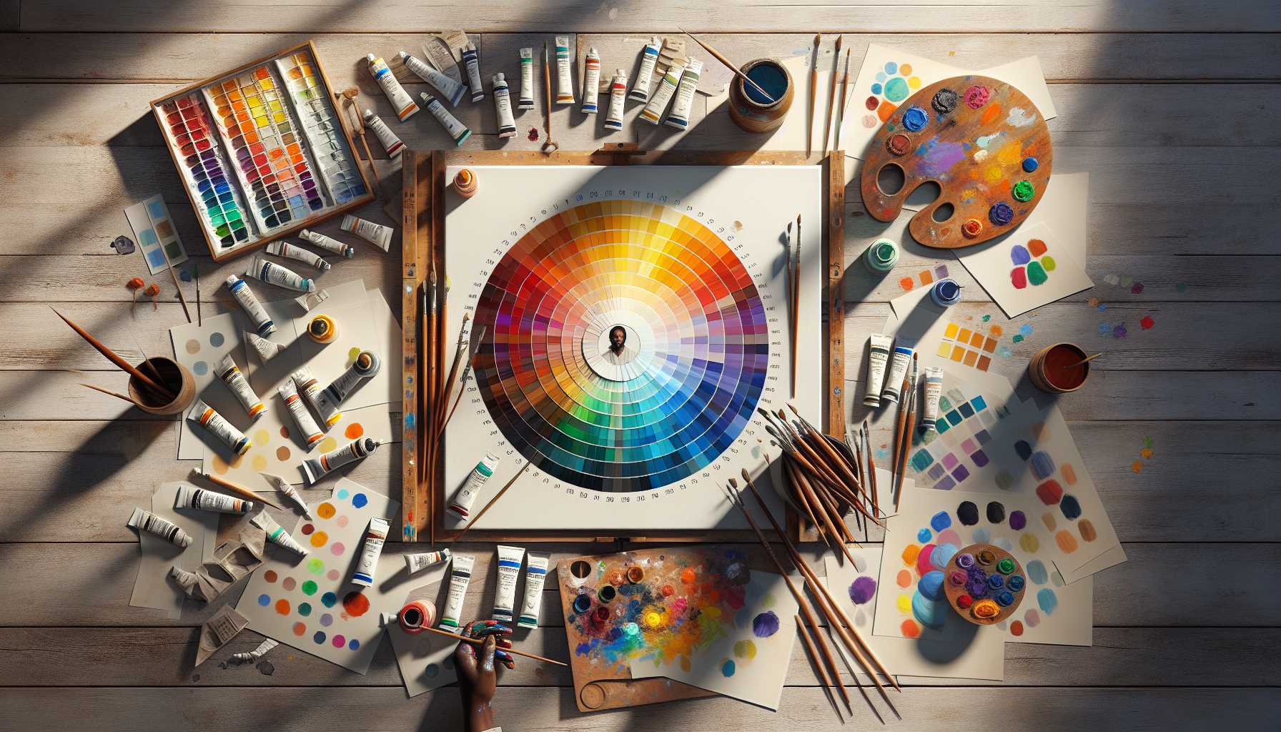
Have you ever pondered why certain pieces of art resonate seamlessly, striking the right chord, while others seem discordant? This enigma often lies in the elusive concept of color harmony. Time to dive in and unravel some high-level principles that can redefine your artwork.
Delving into the Psychology of Color
Colors are not just mere visual treats – they communicate with our inner beings. The color red tends to ignite our adrenaline, while blue has a calming effect. As painters, we become artists of emotions, fusing these sentiments onto our canvases.
The Alchemy of Complementary Colors
Do you recall the color wheel from your art classes? Contrasting colors create alchemy! Blue and orange or purple and yellow; they’re the ideal duos on the dance floor. Experiment with placing these contrasting pairs side by side in your next masterpiece.
Exploring Split-Complementary Schemes
Here’s a fascinating idea: instead of utilizing direct antithetical colors, experiment with one color along with two that sit next to its complement. It’s an ideal move to enhance the finesse of your artwork!
Striking the Temperature Balance in Art
Visualize your painting canvas as a temperature gauge. Warm shades are forward, while cooler colors are retreating. Attaining an ideal equilibrium is akin to culinary art – a sprinkle of warm hues here, a touch of cool tints there.
Embracing the 60-30-10 Rule
Have you ever noticed how interior designers operate? Implement their tactic: 60% of a dominant hue, 30% of a secondary shade, and 10% of an accent color. This formula also weaves magic into paintings!
Setting the Atmosphere with Monochromatic Schemes
Sometimes, simplicity speaks volumes. Employing different tones of a single color can generate extraordinary depth. It’s akin to narrating a story in hushed tones instead of boisterous shouts.
Techniques for Transitional Colors
Consider color shifts as akin to sunset’s progression. Nature seldom jumps starkly from one color to another – it’s a smooth transition. Experiment with softly blending your colors for a touch of professional finesse.
Implementing Color Harmony
Ready to incorporate these principles into your work? Begin simply:
– Initiate with a rough composition
– Strategize your color scheme
– Experiment with combinations on scrap paper
– Trust your gut feeling!
Advice for Color Mixing from the Experts
The experts’ mantra: tidy brushes lead to vibrant colors! Maintain clean equipment and an organized palette. It’s the equivalent of maintaining a neat kitchen while cooking a gourmet meal.
Frequent Color Harmony Faux Pas
We all err. Avoid these common pitfalls:
– Overuse of colors
– Neglecting negative space
– Creating murky colors
– Overlooking contrast in values
Remember, these principles should serve as a blueprint rather than stringent rules. Often, breathtaking art is born from mastering the rules, then audaciously bending them. Keep practicing, and most significantly, savor the journey of playing with colors.
What color blends are you eager to experiment with initially? Your canvas eagerly awaits your creativity! 🎨
[End of Article]
